It was back in Spring 2013 when I first had a chance to play with Ableton’s initial foray into hardware: Push. While initially skeptical that the world needed another controller for Live (Ableton’s popular DAW), using the unit for a while quickly won me over.
However, I never did end up opening my wallet to bring one permanently into my studio environment—something kept holding me back. It was cool—I just wasn’t convinced that it would bring enough value to my musical workflows.
That hesitation recently vanished after tinkering with Ableton’s latest hardware offering, named logically enough, Push 2. Released at the end of 2015 alongside the 9.5 update to Live, Push 2 seems to finally realize the vision that Ableton surely had back in 2013, but didn’t quite completely attain.
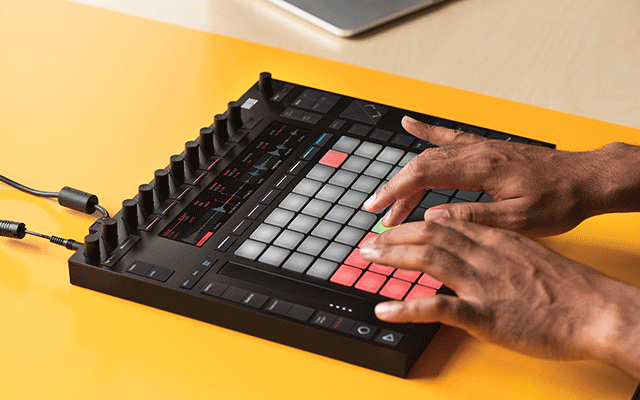
A lot has not actually changed between the two iterations. Ableton continues to insist that the Push is an “instrument” (which it surely can be, but still seems a bit of a stretch as a product descriptor). Both are dominated by an 8×8 grid of pads surrounded by other buttons and knobs. And both have a quartet of basic operating modes (or interface paradigms): What I call a “creative mode” (the unit’s default), drum-machine mode, melodic mode, and a mode designed to map to Live’s Session View as a remote controller.
But a lot has changed. For starters, Ableton decided to go it alone. While the original Push was a collaboration between Akai and Ableton, the Push 2 is the result of bringing the project fully in-house. Whatever the reasons or basis, the overall quality of the product has markedly improved, the aesthetics have improved as well, and at least for me, the Push finally proves its worth as a solid, useful, and powerful tool for music production alongside Live.
Set-up & Use: As was the case with the original Push, setup is dirt simple. On my Mac, no drivers or any actual setup are even required. Plug-in the USB cable, connect the AC adapter, turn it on, load Ableton Live, and you’re done. You do need to ensure that you’re running the 9.5 update (or later).
Like the original Push, and as I noted above, the unit will start-up in a mode I like to refer to as its “creative mode.” It’s designed for effortless stream-of-consciousness creative capture, where you can create tracks, program drums, record clips, and generally have a great time without worrying much about structure or setup or anything else. Ableton’s done a terrific job of giving the Push enough functionality to enable you to focus your attention on the controller, without bouncing back and forth between controller and computer screen. Once I got used to how it works (which is not difficult), I found it to be a truly liberating way to develop musical ideas, and it’s easy to lose yourself for hours with it.
Two distinct “sub modes” of this would be the unit’s drum-machine and melodic modes—two things I loved about the original Push, and which are still just as compelling. Drum-machine mode comes up automatically when you create a drum track, and provides both a step sequencer and direct-playable pads. If you’ve not used a step sequencer to make percussion tracks before, it’s a relatively easy and fun way to lay down basic drums (or even more complex ones), especially when you’re working in electronic genres. Given the array of percussion content in Live (especially the Suite edition), there’s a lot to play with here.
The melodic mode, however, remains a favorite of mine. On non-drum tracks like bass and leads, the unit pops into this mode. Using the song key you’ve selected (e.g., C major, D minor, etc.), the unit maps the notes of the corresponding scale to the pads, highlighting the pads that correspond to the root note of the scale. In short, this approach means that it’s not possible to play a wrong note (if by “wrong” you mean outside the current scale; jazz purists, for one, might argue whether such a note is “wrong,” but for most of us crafting EDM, pop, rock, etc., the definition will suffice). If you don’t know how to play conventional keyboards, or your proficiency isn’t that great, you can still be productive and creative with the Push in this mode. Even though I do play keyboards, I still think this approach is both fun and incredibly useful.
Onstage: Performers who use Live will love Push, too. Its Session View control mode lets you freely trigger sounds or clips (or rows of them) without resorting to mouse clicks. And of course, you still have access to things like mix levels and such—only with the Push 2, it’s even better. Why?
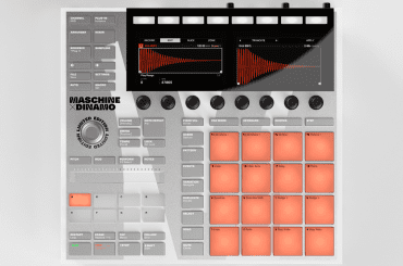
Well, Ableton replaced the old-school, orange-on-black, dot-matrix display of the old Push with a beautiful new color high-res graphical display that’s just plain sexy. But looks aren’t the full story; the resulting control approach greatly improves both usability and the speed of getting to and controlling what you want. It’s one of the best new additions to the unit.
It’s not the only one, however. One of my biggest complaints about the original Push is that the text-labeled buttons were virtually unreadable. In the Push 2, those buttons are bright, clear and visible even in bright room light. (This is likely due to the inclusion of an AC adapter with Push 2, and casting that AC adapter as required—there’s plenty of juice to power all that button backlighting. Push 2 will operate without the AC adapter connected, but the brightness is dramatically affected by the choice to do so.)
Illumination improvement goes for the pads, too. In the original Push, the color trueness and brightness were, bluntly, sub-standard. Two buttons ostensibly the same color (according to Live) were often different shades or brightness levels for no clear reason. That’s completely changed in Push 2; colors are true and consistent, brightness is improved, and it’s much more enjoyable to use them.
Pad improvements extend beyond aesthetics, however. I find the accuracy and playability of the pads to be greatly improved. In the original Push, it seemed like there were three basic response levels—very light, below midpoint, and maximum. While getting the desired result may still require practice, the response range is broader and more accurate. The pads are just tighter, truer, and just more pleasurable to use. It’s precisely this sort of polish that’s evident throughout the Push 2 over the original iteration.
Ableton has included a number of other “spit-and-polish” type enhancements in the Push 2. The arrangement of the buttons seems more logical, and has been expanded in terms of the control capabilities offered, as one example.
There are also new capabilities that span the Push and Live, including changes to the way that samples can be managed with Live’s “Simpler” function, most notably, its new slicing mode that enables a single sample to be chopped into pieces that can be played individually. This can be done “live” and on-the-fly, and easily manipulated via the Push 2, leveraging its new graphical display to make that possible. The net effect is incredibly powerful—and incredibly cool.
Conclusions: When I first reviewed the original Ableton Push back in 2013, it felt very much like a “Version 1.0” product. I expressed confidence at the time that it would get better over time, and Ableton has done precisely that with the new Push 2. With substantially more polish end-to-end, with improved quality, utility and usability, I’d now consider it a virtual “must-have” tool for Ableton Live users. But beyond these attributes, Push 2 is just plain fun to use, providing a powerful tool for capturing musical ideas, manipulating those ideas, and performing them for others.
One other change from the original Push to the Push 2: the price has gone up by a third. That makes a street/retail price of just under $800—quite a jump, and it means that Push 2 is even more of an investment for those considering it. Is it worth it? For me, the answer is an unequivocal yes.


